Benjamin Moore has made its pick, and it is a confident one. The Benjamin Moore color of the year 2027 is Webster Green (HC-130) — not a brand-new invention, but a storied shade pulled from the company’s own Historical Collection. It takes the crown from Silhouette (AF-655), the deep, moody brown that defined 2026.
If you have been waiting for permission to paint your trim, built-ins or kitchen cabinets something richer than white, this is your sign. Here is what Webster Green actually looks like, the eight colors launching alongside it, and exactly how to use it room by room — without turning your home into a period drama set.
What Is Webster Green, the Benjamin Moore Color of the Year 2027?
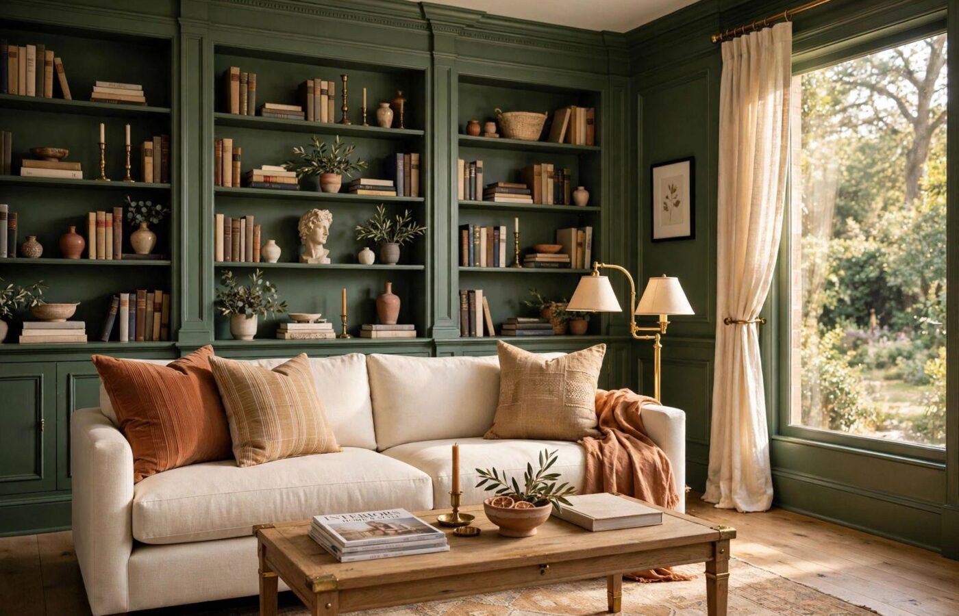
Webster Green is a deep, settled green with the kind of depth you usually only get from old houses and good lighting. It sits in the same family as pine and pewter-green: saturated enough to read as a deliberate design choice, but muted enough to behave almost like a neutral next to wood, stone and brass.
Because it comes from the Historical Collection, it was created to suit traditional architecture — crown molding, wainscoting, paneled doors, bookcases. But do not file it under “colonial only.” On flat-front cabinets or a single modern accent wall, the same shade reads tailored and completely current.
One honest caveat: Benjamin Moore has not published official LRV or undertone data with the 2027 announcement yet. Greens are notorious light-shifters, so everything in this guide comes with one instruction attached — sample it in your own rooms first. More on that below.
Why Benjamin Moore Chose a Historic Green for 2027
Andrea Magno, the company’s vice president of color marketing and development, says the shade suits “architectural situations” — and the brand’s strongest guidance is to use it on trim, millwork and built-ins rather than defaulting to four walls. In her assessment it has depth, character, versatility and a genuine historic pedigree.
The bigger story is what shoppers told the team during their research. People are tired of colors that feel like a trend cycle. They want choices that feel intentional and enduring — rooms that still look right in five years. The research kept landing on the same conclusion: green has remarkable staying power. It headlined the jewel tones of the 1920s and 1930s, softened into 1950s mint, and today shows up everywhere from sage to pine to pewter.
Hannah Yeo, senior color marketing manager, put it neatly to ELLE Decor: “This is not a new shade, but it just feels particularly relevant in the way that people want to live today.” The team wanted a color that “reassures and endures,” and the company describes rooms painted in Webster Green as “distinctive, collected, and continually new.”
Translation for the rest of us: the Benjamin Moore color of the year 2027 is less about chasing a look and more about choosing a backdrop your furniture, art and everyday life can keep changing against.
The Full 2027 Palette: Eight Colors
Webster Green does not arrive alone. The Benjamin Moore color of the year 2027 palette rounds it out with seven supporting shades — a creamy white Magno predicts will be the quiet favorite, a watery blue, a spiced terracotta and more. Here is the full set:
| Color | Character | Where It Works Best |
|---|---|---|
| Webster Green (HC-130) | Deep historic green | Trim, built-ins, cabinets, accent walls |
| White Down | Creamy, soft white — never stark | Walls, ceilings, the 60% base color |
| Nelson Blue | Watery blue from the Williamsburg collection | Bedrooms, bathrooms, coastal accents |
| Wild Aster | Sophisticated, grown-up pink | Dining rooms, powder rooms, soft accents |
| Antique Copper | Spicy terracotta | Accent chairs, doors, the warm 10% |
| Durango | Deep olive | Studies, dens, lower cabinets |
| Townsend Harbor Brown | Chocolate-meets-burgundy, atmospheric in matte | Libraries, media rooms, moody bedrooms |
| Shakespeare Tan | Complex ochre that shifts gold-to-green by light | Hallways, living rooms, warm neutrals |
Notice the temperature balance: the greens and browns do the grounding, White Down and Shakespeare Tan keep things light, and Wild Aster and Antique Copper supply the warmth. It is a palette designed to mix across one whole house, not just inside one room.
How to Use Webster Green Room by Room
This is where the announcement becomes a shopping list. Below is the room-by-room playbook we would follow at home — and if you want the broader rules first, our paint color guide walks through undertones, finishes and the 60-30-10 rule in depth.
Living Room
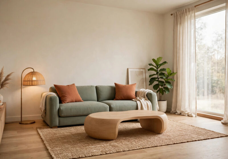
Start where the brand points you: the architecture. Paint built-in bookcases, a fireplace surround or picture-frame molding in Webster Green in a satin finish, and keep the walls White Down. The green reads like furniture — expensive, intentional furniture. If you have no millwork, one full wall behind the sofa works just as well. Balance it with a light rug, linen upholstery and at least one warm metal, like brass or aged bronze, so the depth feels rich rather than heavy.
Kitchen & Cabinets
Webster Green’s finest hour might be on cabinets. It flatters both Shaker and flat-front doors, hides everyday splashes better than white, and pairs beautifully with marble-look counters and unlacquered brass hardware. Use a satin or semi-gloss cabinet finish for scrubbability. Uppers and lowers in green with a White Down ceiling keeps a small kitchen grounded rather than dark; in a larger kitchen, green lowers with white uppers is the safer split.
Bedroom
Green is the most restful family on the color wheel, and a muted historic green behind the headboard makes the whole room exhale. Keep bedding in warm whites and natural textures — washed linen, wool, cane — and choose matte or eggshell so the color absorbs light softly. If a full wall feels like a lot, paint just the headboard zone, or a pair of nightstands, for the same effect at sample-pot cost.
Bathroom
A Webster Green vanity is the fastest way to make a builder-grade bathroom look designed. Satin is the practical sheen here — it shrugs off humidity and wipes clean. Pair it with white tile, black or brass fixtures and a warm wood mirror frame. And in a powder room with no windows, go all in: walls, trim and ceiling in the same green turns a tiny box into a jewel box.
Entryway & Trim
This is the brand’s strongest-use case, and the lowest-risk place to start. A front door in Webster Green — semi-gloss, so it glows — is instant curb appeal. Inside, try it on stair risers, a built-in bench, the backing panel behind coat hooks, or all the interior doors on one floor while the walls stay light. Trim and doors in satin or semi-gloss will quietly make every room they touch look more considered.
Colors That Pair With Webster Green
Use the 60-30-10 rule and the palette does the work for you. Run roughly 60 percent White Down or Shakespeare Tan across walls, ceiling and big upholstery, 30 percent Webster Green on cabinets, built-ins, an accent wall or curtains, and 10 percent Antique Copper — a chair, cushions, a painted side table — for heat.
For a cooler, collected scheme, swap the accent to Nelson Blue. Green and watery blue are natural neighbors and especially lovely in bedrooms. For a moody library or den, flip the ratio entirely: Webster Green walls at 60 percent, Townsend Harbor Brown in leather and wood at 30, and brass and cream accents at 10.
Webster Green vs the Rival 2027 Greens
Benjamin Moore is not alone. Sherwin-Williams named Celery — a light, cheerful yellow-green — its 2027 pick, while Behr chose Grounded, an olive with warm brown undertones. Three major brands landing on green in the same year tells you this is the industry-wide story of 2027, not a one-brand bet.
The personalities differ, though. Celery is springlike and bright — best for small rooms and accents, and for anyone who wants green without darkness. Grounded is the earthiest of the three, halfway to a neutral. The Benjamin Moore color of the year 2027 sits deepest and most traditional of the trio: less “fresh paint,” more “this house has always looked this good.” Choose Celery for lift, Grounded for warmth, Webster Green for architecture.
Before You Buy: Sampling and Sheen Tips
Because no official LRV or undertone data has been published yet, sampling is not optional with this color. Buy the largest sample pot available, paint two coats onto a white foam board — not directly onto the wall — and move the board around the room. Check it beside the window at noon, under your lamps at night, and next to the floor and fabrics it will live with. Deep greens can swing blue in north-facing light and yellow in warm evening light.
Sheen matters just as much as shade. A simple guide:
- Ceilings and low-traffic walls: flat or matte
- Living rooms and bedrooms: matte or eggshell
- Kitchens, bathrooms and cabinets: satin
- Trim, doors and built-ins: satin or semi-gloss
Finally, do the math before the store run. Deep colors like Webster Green usually need two coats for full, even depth, so measure your walls and run the numbers through our free paint calculator. It works out the gallons and quarts for you — so you are not making a mid-project paint run with green on your hands.
FAQ
What is the Benjamin Moore color of the year 2027?
It is Webster Green (HC-130), a deep historic green from the company’s Historical Collection. It follows Silhouette (AF-655), the deep brown chosen for 2026.
Is Webster Green a brand-new color?
No — and that is the point. It is an established archival shade, not a new formula. Benjamin Moore chose it because it feels particularly relevant to how people want to live today: intentional, reassuring and built to endure.
What colors pair best with Webster Green?
Start inside the 2027 palette: White Down for walls, Shakespeare Tan for warm neutral depth, Antique Copper for a spicy accent, and Nelson Blue for a cooler, coastal pairing. Warm woods and brass sit comfortably next to it too.
What sheen should I use for cabinets and trim?
Satin is the workhorse — durable, scrubbable and softly reflective. Step up to semi-gloss on front doors and high-traffic trim where you want extra glow and the easiest cleaning.
Conclusion
Webster Green is a rare color-of-the-year pick that asks very little of you. You do not need a new house or a full renovation — a door, a bookcase, a vanity or one honest accent wall is enough to feel the shift from “of-the-moment” to “collected.” Sample it this weekend, start with the trim, and let the green do what it has done for a hundred years: endure.