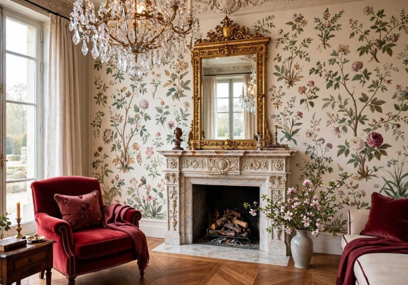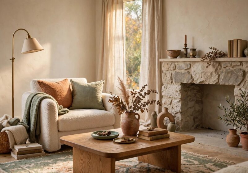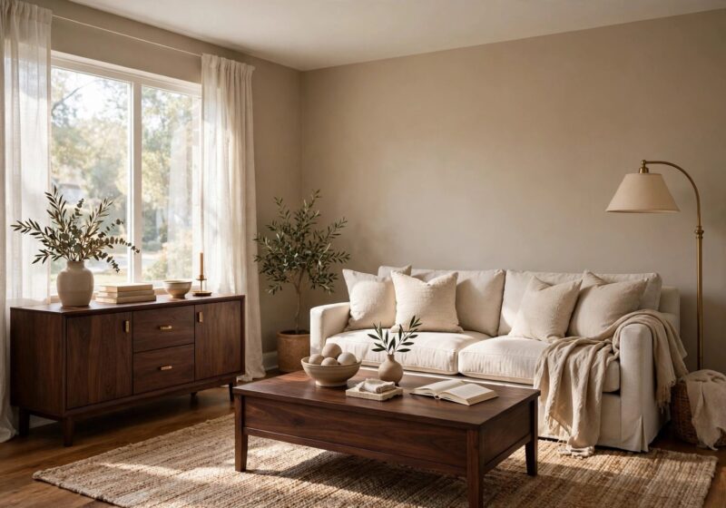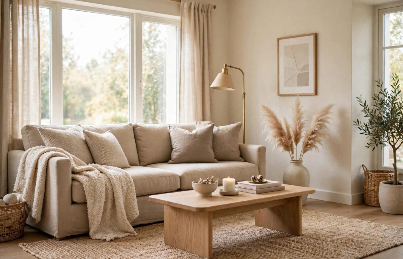
Cool grey has had a long run as the default neutral in American homes, but the walls are changing. A new report published on 12 November 2026 puts a name on the shade taking its place: oat tones home decor — the soft family of cream, sandy beige, muted taupe and warm greige quietly replacing cold greys in living rooms, bedrooms, kitchens and bathrooms. Designers say the shift is not about one paint color, but a warmer, softer base that makes a whole home feel calm and welcoming.
That is what makes this trend different: oat tones do not ask you to repaint everything or buy new furniture. They sit underneath what you already have and make it look warmer. This guide explains what oat tones are, why grey is fading, which shades to use, how to use them room by room, and the mistakes that turn a soft neutral into a flat, boring wall.
What Are Oat Tones?
Oat tones take their name from the grain: the pale, warm beige of raw oats, somewhere between cream and light taupe. The family includes creamy whites with a warm cast, sandy beige, muted taupe and warm greige — a grey-beige blend that leans warm instead of cool. None is a strong color; their job is a background that feels alive.
The difference is the undertone: cool grey carries a blue or violet cast that can feel crisp in summer and chilly in winter. Oat tones carry a small dose of yellow, pink or green instead, so the wall reads warm in morning light and evening lamplight alike. In a north-facing room, where cool grey can turn almost blue, an oat tone stays soft and golden; in a south-facing room, it holds its character against strong sun.
Designers call oat tones a friendly neutral base. Emily Caron, Senior Interior Design Associate at SPAN Architecture, says the shades sit comfortably next to brighter colors and distinctive design elements, so a bold sofa or a piece of art does not fight the wall behind it. Interior designer Liliana Olt of Robin Rains Interior Design adds that they work well with existing furniture and family heirlooms — practical, since most people redecorate around what they already own.
Why Cool Grey Is Fading in 2026
Oat tones are the softest expression of a move toward warmth building all year — the evidence is in the colors the big brands chose. Sherwin-Williams named Universal Khaki SW 6150, a warm midtone neutral, its 2026 Color of the Year; Benjamin Moore chose Silhouette AF-655, a deep smoky espresso brown; Behr picked Hidden Gem, a smoky blue-green jade. For 2027, Sherwin-Williams is following with Celery, a soft herbal green. Every pick moves away from cool, steely surfaces and toward colors that feel natural and lived-in.
The 2026 U.S. Houzz Fall Design Trends Report, from interviews with nearly 50 home design professionals, found warmth is no longer a trend but the new baseline: homeowners are layering warm wood tones, earthy colors, multiple textures and natural materials for more depth and personality. The same report found that 61 percent of renovating homeowners plan to stay in their homes for 11 years or more, so the colors chosen now have to last.
The Oat Tones Palette: Shades That Work
Oat tones are a family, not a single paint chip: the right member depends on the room’s light and the finishes already in it. The table covers the core shades and the paint colors designers are recommending, including the two named in the report.
| Oat shade | Character | Best use |
|---|---|---|
| Sandy beige | Mid-tone beige with a golden undertone | Living room and bedroom walls |
| Muted taupe | Deeper grey-beige, warm leaning | Accent walls and rooms with dark wood |
| Benjamin Moore Edgecomb Gray HC-173 | Soft warm greige | Whole-home walls, white trim |
| Portola Paints Rustica | Earthy, sun-baked neutral | Feature walls and plaster-look finishes |
| Sherwin-Williams Sanderling SW 7513 | Warm greige-taupe, creamy undertone | Bedrooms and living rooms wanting depth |
If choosing between two shades, the lighter one is usually safer: oat tones darken a step on a full wall, especially under warm lamplight, so a pale chip often reads as a true sandy beige at home. Pick the lighter chip and test it large — the steps are below.
Oat Tones Home Decor Room by Room
Living rooms: the warmest use of all
The living room is where oat tones home decor makes its strongest case. A sandy beige or warm greige on the main walls flatters everything in the room: a linen sofa in cream or oatmeal, a walnut or light oak coffee table, a rug in a deeper taupe. The room feels finished before the accessories go up — a reason designers reach for oat tones in open-plan spaces. Keep one contrast — a dark wood sideboard or deep olive armchair — then soften it with a boucle throw or a linen cushion a shade deeper than the wall.
Bedrooms: calm without the chill
A cool grey bedroom can feel crisp and hotel-like; an oat bedroom feels restful. Cream oat walls with bedding in white, cream or dusty sage make a soft backdrop that does not glare in morning light. Carry the same oat onto the ceiling in a lighter tint and the room feels taller. For a primary suite, try muted taupe behind the bed and cream oat on the other three walls: the darker wall anchors the headboard, the lighter walls keep the room bright. Warm wood nightstands and brass lamps finish it.
Kitchens: a softer white alternative
Kitchens are where oat tones solve a real problem. Stark white cabinets show every fingerprint and can look clinical under bright task lighting; a cream oat or warm greige cabinet reads as a soft neutral instead, and suits transitional, farmhouse and traditional kitchens far better. Pair oat cabinets with brass or matte black hardware, open shelving in light oak and a soft white or pale stone backsplash. On kitchen walls, a sandy beige holds up better than white against splashes and steam. If the cabinets are already white, paint the island muted taupe — it becomes the room’s warm anchor.
Bathrooms: the spa effect
Bathrooms are where oat tones earn their reputation as a spa color. Warm neutral paint with textured tiles — a handmade-look subway tile, a fluted stone slab, a pebble mosaic on the shower floor — creates the relaxed, spa-inspired setting designers keep recommending. The paint’s warmth balances the coolness of porcelain and chrome, so the room feels like a retreat. In a small bathroom keep the palette pale — cream oat walls, light stone floor, white fixtures — with warmth from a wooden stool or brass faucet. In a larger bathroom, a muted taupe on one wall adds depth.
What Pairs Well With Oat Tones
Oat tones are built to sit underneath other colors: let the oat be the quiet background, then add contrast in one direction at a time.
| Partner | Examples | Effect |
|---|---|---|
| Layered neutrals | Deep browns, taupe, warm whites | Calm, tonal, with depth |
| Olive green | Sage, moss, deep olive | Natural, garden feel |
| Ochre and rust | Mustard, terracotta, burnt orange | Warmth and energy |
| Dark blue | Navy, slate, deep teal | Sharp contrast |
| Natural wood | Light oak, walnut, rattan, cane | Wood grain keeps oat walls from looking flat |
Use a contrast color in one place first — olive cushions, a rust throw, a navy armchair — and live with it for a week before adding more. Three strong accents with no clear hierarchy stop looking calm and start looking accidental.
Texture: The Secret Ingredient
The most common reason an oat room fails is not the color; it is the lack of texture. A flat oat wall, sofa and rug is a beige box no paint shade can save. The fix is to mix surfaces: fabrics, tiles, paint and wallcoverings. Use three textures in every oat room — woven (linen, jute, rattan, boucle) for a hand-made feel, smooth (polished wood, brass, glass, glazed ceramic) for a clean edge, and soft (wool, velvet, thick cotton) to rest on. In a bathroom, warm neutral paint plus textured tile is the combination designers cite most — the tile’s relief catches the light, the paint’s warmth keeps the stone from feeling cold.
5 Mistakes to Avoid With Oat Tones
- Going too yellow. Some beiges lean hard yellow under warm bulbs and look dated. If it reads yellow at night, pick a greyer cast.
- Using only one shade everywhere. One oat on every wall, sofa and rug is monotonous — use two or three tones for light and shadow.
- Ignoring your fixed finishes. Oat paint can clash with cool grey stone, blue-grey tile or a pink-toned floor. Check your swatch against the flooring and largest furniture piece first.
- Skipping texture. A flat oat room is a boring room. Spend your first post-paint money on a textured rug or linen curtain, not another accessory.
- Painting without a sample. Oat tones shift more than most colors between store, swatch and wall. A tester pot and a large swatch are the whole decision.
How to Test Oat Tones Before You Commit
Oat tones are among the hardest colors to judge from a screen — the beige-grey balance shifts with every change of light. Follow these steps before buying a gallon:
- Buy a sample, not a chip. Get a tester pot and paint a swatch at least 2 feet by 2 feet on the wall you plan to paint. A paper chip tells you almost nothing about an oat.
- Check it at three times of day. Look at the swatch in morning light, afternoon sun and evening lamplight. A good oat stays warm throughout; if it turns yellow, pink or grey, your lighting is fighting it.
- Hold it against your finishes and trim. Place the sample beside your flooring, largest furniture piece and trim white: it should echo the warmth in wood and brass, not clash with cool stone.
- Try one wall first. If unsure, paint one wall and live with it for a few days. A week with the shade beats an hour of staring at chips.
FAQ
What are oat tones in home decor?
Oat tones are a family of warm, soft neutrals — cream, sandy beige, muted taupe and warm greige — named for the pale beige of raw oats. In oat tones home decor, they replace cool grey as a room’s base color, giving walls a warm, calm feel.
Why are oat tones replacing cool grey?
Cool grey carries a blue undertone that can feel chilly. Oat tones carry a warm undertone instead, so rooms feel softer and more lived-in. The shift matches the wider 2026 move toward warm neutrals in the color-of-the-year picks from Sherwin-Williams, Benjamin Moore and Behr, and in the Houzz Fall 2026 report.
What colors go with oat tones?
The best partners are layered neutrals — deep browns, taupe, warm whites — and olive green, ochre, dark blue and rust for contrast. Natural materials matter as much as color: light oak, walnut, brass, matte black, linen, boucle and wool keep an oat room from looking flat.
Which rooms work best with oat tones?
Oat tones work in almost every room — strongest in living rooms and bedrooms; they soften kitchens as an alternative to stark white cabinets; in bathrooms, warm neutral paint with textured tiles creates a spa-inspired setting. Keep the shade lighter in small or north-facing rooms.
Conclusion
Oat tones are not a loud trend, and that is precisely why they are worth taking seriously. While the color-of-the-year announcements chased deep greens, smoky browns and herbal greens, oat tones quietly do the job most homeowners actually need: warming a room, flattering the furniture people already own, staying calm through every change of light. If your walls still carry the cool grey of five years ago, oat tones home decor is the smallest change that makes the biggest difference — a tester pot, a large swatch and a textured rug are all it takes.