Sherwin-Williams has named Sanderling SW 7513 its Color of the Month for November 2026, and the timing is no accident. As the days shorten and homeowners start spending their evenings indoors, the paint giant is pointing toward warmth: Sherwin-Williams Sanderling is a rich greige-taupe with soft creamy undertones, a shade that sits between gray and beige and makes a room feel grounded, not dark. It is the kind of color you choose when you want a home that feels settled before the holiday season arrives.
That is a practical job for a paint color, and Sanderling is built for it. A November shade has to warm rooms that get less daylight, sit beside dark woods and rich autumn textiles, and stay easy to live with after the decorations come down. This guide explains what Sanderling looks like on a wall, where it works best room by room, what to pair it with, and how to test it before you buy.
What Is Sherwin-Williams Sanderling SW 7513?
Sherwin-Williams Sanderling SW 7513 is a warm greige-taupe — a blend of gray and beige with a creamy undertone that keeps it from reading cold. Unlike the cool, steely grays of a decade ago or the yellow-leaning beiges that can look dated, Sanderling sits in the middle. In bright daylight it reads as a soft, warm taupe; in the evening it deepens into a richer neutral without turning muddy.
The name fits the color. A sanderling is a small, pale shorebird, and the paint borrows that same quiet, natural warmth. It is not a loud color. It works as a foundation: a backdrop that makes furniture, art and textiles look better and ties an open floor plan together.
Paint professionals point to three qualities that set it apart. First, adaptable warmth: it adds depth without enclosing a room, so even a modest living room keeps its sense of space. Second, a soft foundation: it supports both clean contemporary furniture and traditional woodwork, so it rarely fights the style a home already has. Third, lighting flexibility: it holds its character under morning natural light and evening warm lamplight alike, so the color you love at noon is still the color you see at dinner.
Why Sanderling Fits November 2026
Sanderling arrives at the end of a year that has moved steadily toward warmer, earthier color. Sherwin-Williams’ own 2026 Color of the Year, Universal Khaki SW 6150, is a warm midtone neutral built around the same idea: nature-inspired warmth and colors that feel lived-in rather than staged. Sanderling is the quieter cousin of that pick — less khaki, more taupe, and easier to use across a whole house.
The same shift shows up across the other brands. Benjamin Moore chose Silhouette, a deep smoky espresso brown, for 2026, and Behr picked Hidden Gem, a smoky blue-green jade. Sherwin-Williams itself will follow Sanderling’s warmth with Celery, a soft herbal green, as its 2027 Color of the Year. The common thread is calm: after years of bright, high-contrast interiors, the 2026 palette is about colors that lower the volume of a room. Sanderling belongs in that movement, and as a November pick it is aimed at the season when people notice their walls most — the weeks when guests come over and the house is lit from the inside.
There is also a practical reason the shade works now. Repainting in late autumn is a common small upgrade before hosting, because a single room can be transformed in a weekend. A warm neutral like Sanderling is a low-risk choice: it covers well, forgives the flaws of older walls better than a stark white, and photographs beautifully in warm holiday light.
Sherwin-Williams Sanderling Room by Room
Living rooms and open floor plans: the strongest use
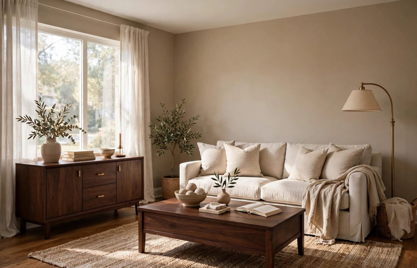
The living room is where Sanderling does its best work. Painted across a living room — especially one that opens into a dining area or kitchen — it creates a continuous, inviting backdrop for high-traffic family areas. Dark wood furniture reads beautifully against it: a walnut credenza or deep-stained coffee table gains contrast and presence, while cream or oatmeal upholstery keeps the palette from turning heavy.
In an open plan, carry Sanderling from the entry through the living space rather than stopping at a doorway. The unbroken wall color makes the whole floor feel larger and more connected, while each area keeps its own identity through furniture and rugs. Add texture to keep the neutral from flattening out — a nubby linen sofa, a woven jute rug, or a fluted wood panel behind the television.
Bedrooms and primary suites: calm for cold months
Bedrooms need a color that feels restful at night and gentle in the morning, and Sanderling delivers a spa-like calm without the chill of a cool gray. On bedroom walls it creates a soft, enveloping backdrop for bedding in white, cream, sage or dusty blue. Because the shade is muted rather than bright, it does not glare in morning light — a real advantage in east-facing rooms.
Pair it with warm wood nightstands, brass or matte black lamps, and layered bedding in natural fibers. Carrying the color onto trim and doors in the same room gives a seamless look, letting the architecture show through shadow and light instead of color contrast.
Kitchen cabinets: a softer white alternative
Sanderling is a sophisticated alternative to stark white cabinets. On kitchen cabinets it reads as a warm greige rather than a white, which suits transitional, farmhouse and traditional kitchens far better than a clinical bright white. Pair it with warm brass or matte black hardware, open shelving in warm wood, and a backsplash in soft white or pale stone.
Home offices and libraries: quiet focus
A home office needs a wall color that supports concentration without feeling sterile, and Sanderling strikes that balance — serious enough for video calls, warm enough for a full workday. Dark wood desks and leather chairs look richer against it, and one deep accent, like a charcoal bookcase back or a brass desk lamp, gives the room definition without breaking the calm.
Entryways and exteriors: a warm first impression
Sanderling also works where guests form their first impression. In a foyer, it warms a space that often gets the coldest light in the house, and it pairs naturally with a wood front door, a woven runner and a console in dark walnut. On an exterior, use it in small doses — a front door surround or shutters — where its warmth can pick up the tones of brick, stone or wood siding without overwhelming the facade.
What Pairs Well With Sanderling
| Role | Sherwin-Williams shade | Why it works |
|---|---|---|
| Clean trim and ceilings | Alabaster SW 7008 or Pure White SW 7005 | Soft off-whites frame the taupe without harsh contrast. |
| Moody accent wall | Peppercorn SW 7674 or Rock Bottom SW 7062 | Deep charcoal and dark olive tones add drama beside the warm neutral. |
| Earthy complement | Universal Khaki SW 6150 | The 2026 Color of the Year coordinates with lighter tan and stone textures. |
| Warm accent | Terra cotta or clay tones | Echoes the creamy warmth and suits an adjoining room or textiles. |
| Wood and metal | Dark walnut, brass, matte black | Dark grain pops against the taupe; warm metals add glow, black adds definition. |
The pattern is simple: let Sanderling be the quiet background, then add contrast in one direction at a time — darker with wood and charcoal for drama, or lighter with cream linen and pale stone for airiness. Pulling both ways at once loses the calm that makes the color work.
Sanderling Compared to Other Warm Neutrals
Warm neutrals are crowded territory, and Sanderling is easy to confuse with its better-known neighbors. The differences are subtle on a swatch and obvious on a wall.
| Shade | Character | Choose it when |
|---|---|---|
| Sanderling SW 7513 | Greige-taupe, creamy undertone, balanced warm | You want warmth with depth, in living rooms and bedrooms. |
| Accessible Beige SW 7036 | Warmer, more beige, slightly lighter | You want a classic greige that leans beige in sunny rooms. |
| Agreeable Gray SW 7029 | Cooler gray-beige, more gray than taupe | Your light is warm and you want to cool the room down. |
| Universal Khaki SW 6150 | Deeper khaki, earthier, more presence | You want a statement neutral with a green-brown undertone. |
| Shoji White SW 7042 | Much lighter off-white with a warm greige cast | You want the same family, but barely-there color on the wall. |
If Accessible Beige reads a touch yellow in your light, Sanderling is the next shade to test — it keeps the warmth while adding gray depth. If Agreeable Gray feels too cool in a north-facing room, Sanderling warms the same space without swinging to beige. And if you love Universal Khaki but want something quieter for a bedroom, Sanderling gives you the same earthy mood at a lower volume.
How to Test Sanderling Before You Buy
Greige-taupe shades are among the hardest colors to judge from a screen, because the balance between gray and beige shifts with every change of light. Follow these steps before buying a gallon:
- Buy a sample, not a chip. Get a tester pot and paint a large swatch — at least 2 feet by 2 feet — on the wall you plan to paint. A small paper chip tells you almost nothing about a greige.
- Check it at three times of day. Look at the swatch in morning light, afternoon sun and evening lamplight. Sanderling should stay warm and taupe throughout; if it turns noticeably pink, yellow or gray, your lighting is fighting the undertone.
- Hold it against your fixed finishes. Place the sample beside your flooring, your largest furniture piece and your countertops. The creamy undertone should echo the warmth in dark wood and brass, not clash with cool gray stone or blue-gray tile.
- Test it beside your trim color. Hold the swatch next to the white you plan to use on trim — Alabaster or Pure White are the natural partners. The contrast should feel soft and clean, not stark.
- Try the accent first. If you are unsure about a whole room, paint one wall, or a single piece of millwork, and live with it for a few days before committing.
FAQ
What is Sherwin-Williams Sanderling SW 7513?
Sherwin-Williams Sanderling SW 7513 is a warm greige-taupe paint color with soft creamy undertones, named Sherwin-Williams’ Color of the Month for November 2026. It sits between gray and beige: warm enough to feel cozy, muted enough to work as a whole-room neutral.
Is Sanderling a warm or cool color?
Sanderling is a warm neutral. Its creamy undertone gives it a soft, inviting warmth, while the gray in the mix keeps it from reading yellow or dated. It reads warmer than Agreeable Gray and cooler than a traditional beige, so it works in both north-facing and south-facing rooms.
Where can I use Sherwin-Williams Sanderling in my home?
Sherwin-Williams Sanderling works on living room and bedroom walls, kitchen cabinets, home office walls, and in entryways. It pairs best with dark wood furniture, neutral upholstery, brass or matte black hardware, and trim in Alabaster SW 7008 or Pure White SW 7005.
What colors go with Sanderling SW 7513?
The best partners are soft off-whites for trim, deep charcoals like Peppercorn SW 7674 for accent walls, Universal Khaki SW 6150 for an earthy complement, and warm materials like dark walnut, terra cotta and brass. Avoid cool blue-gray stone and tile, which can fight the creamy undertone.
Conclusion
Sherwin-Williams Sanderling SW 7513 is not a dramatic color, and that is precisely why it works as a November pick. While the 2026 color season chased deep greens, smoky browns and airy whites, Sanderling quietly does the job most homeowners actually need: it warms a room, flatters dark wood and natural textures, and stays calm through every change of light. It is a color chosen for the season when people live indoors — and for the years after, when the holidays are over and the walls still have to look right.