Brown interior design trends are having a moment that nobody who lived through the 1970s would have predicted — and yet this comeback looks nothing like the dark, heavy rooms of that era. Published on October 27, 2026, a fresh roundup of the movement pulls together the numbers behind it: designers are moving away from all-white and all-grey rooms, and warm browns — chocolate, espresso, mushroom and taupe — are bringing depth, comfort and personality back into modern homes. If your home still feels a little cold and clinical, brown may be the easiest warm fix you can make without a renovation.
This guide explains why brown interior design trends are rising now, which shades actually work in real homes, and how to use them room by room — without turning your living room into a cave. You will also find a shade-by-shade table, pairing rules for warm and cool browns, and the sampling steps that keep a rich color from going wrong.
Why Brown Interior Design Trends Are Rising Now
The shift starts with a feeling. After years of grey floors, white walls and black hardware, homeowners are asking for rooms that feel safe, personal and lived in rather than photographed. Designers quoted in the October 27 roundup say exactly that: clients want homes that feel comforting and individual, and brown delivers warmth in a way white never could. It is the color of wood, leather, coffee and earth — materials we already associate with comfort — so a brown room reads as welcoming before a single piece of furniture goes in.
The survey data backs up the feeling. According to Samplize, brown appeared on 13.4 percent of homeowners’ paint shortlists, up from 9.2 percent just two years earlier. That is a jump of more than four percentage points in a category where tastes usually move slowly. The 2026 1stDibs Designer Trends Survey tells the same story from the professional side: chocolate brown was named a leading trend by 33 percent of the 468 design professionals surveyed — roughly one designer in three. When homeowners and designers agree this clearly, a trend is not a passing fad; it is a genuine change in taste.
Paint brands have been pointing the same way for two years. Pantone named Mocha Mousse its 2025 Color of the Year, Benjamin Moore chose Cinnamon Slate for 2025 and Silhouette for 2026, and for 2027 the brown family keeps winning: Dunn-Edwards picked French Press Coffee, C2 Paint named Pueblo, and Little Greene selected Marle. Each brand arrived at brown independently, which is the strongest sign that the color is responding to something real in how people want to live, not to a single marketing campaign.
The Brown Shades Designers Are Actually Using
Not all browns behave the same way, and choosing the wrong undertone is the most common reason a brown room disappoints. The trick is to sort browns into two families — warm and cool — and then match the family to your light, your wood tones and your existing furniture.
| Shade | Family | Character | Best Use |
|---|---|---|---|
| Chocolate brown | Warm | Rich, deep, grounding | Accent walls, libraries, dining rooms |
| Espresso brown | Warm to neutral | Near-black depth, dramatic | Cabinets, built-ins, front doors |
| Mushroom brown | Cool to neutral | Soft, grey-brown, easy to live with | Whole rooms, bedrooms, hallways |
| Taupe | Neutral | Light, flexible, quietly warm | Open-plan walls, rentals, small rooms |
| Mocha | Warm | Milky, creamy brown | Living rooms, kitchens, nurseries |
| Terracotta brown | Warm | Earthy, sun-baked, energetic | Entryways, accent walls, tiles |
Warm browns — chocolate, espresso, mocha and terracotta — pair naturally with cream, beige, tan and terracotta tones, plus warm woods like walnut and oak. They glow in rooms with warm artificial light and south-facing sun. Cool browns — mushroom and greyer taupes — sit happily next to soft blue, sage and evergreen, and they suit north-facing rooms where a warm brown might turn orange. If you are unsure which family your room needs, look at your fixed elements: warm wood floors and brass fixtures lean warm, while grey stone and chrome lean cool.
Texture is what separates modern brown from the 1970s version. Designers pair brown paint with plaster, Roman clay and limewash, which break up flat color with subtle movement, and they mix textures — leather, linen, matte wood, rattan — rather than repeating one flat brown surface.
Brown Interior Design Trends Room by Room
If you want the broader rules first, our paint color guide walks through undertones, finishes, and the 60-30-10 rule in depth. Below is how to bring brown into each room without overdoing it.
Living Room
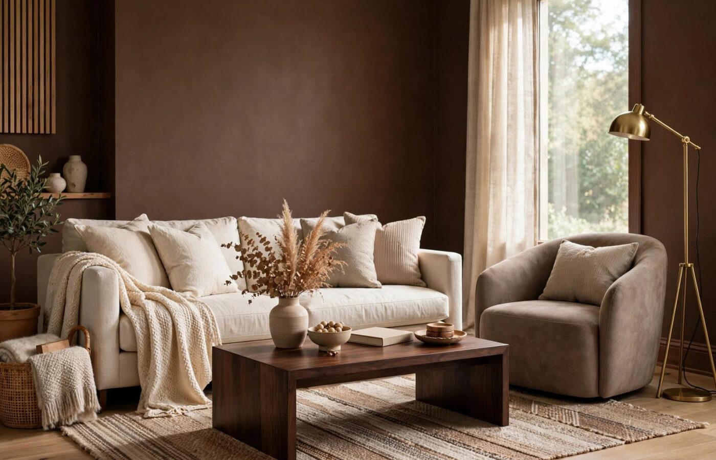
The living room is the safest place to go brown, and also the place where restraint matters most. Paint one wall chocolate brown — behind the sofa or the fireplace — and keep the other three walls in warm cream or light taupe. That single dark wall gives the room a focal point, while the light walls keep it bright. Anchor the look with a cream sofa, a walnut coffee table and one brass accent. If the room is small or north-facing, use mushroom brown on all four walls instead: you get the warmth without losing light.
Kitchen and Cabinets
Brown kitchen cabinets are one of the fastest-growing uses of the trend, because they break up the all-white kitchen without the commitment of a bold color. Espresso cabinets with brass or matte black handles look expensive next to cream walls and light stone counters, and they hide everyday marks far better than white. In a small kitchen, try brown only on the lower cabinets and keep uppers white or cream. Before you commit, paint one cabinet door and live with it for a week; espresso can read almost black in a dim kitchen.
Bedroom
A bedroom is where brown earns its reputation for comfort. A mocha or mushroom wall behind the bed, paired with cream bedding and natural linen curtains, creates a cocooning effect white walls cannot match. Layer the textures — a knit throw, a leather bench, wooden bedside tables, one warm metallic lamp — and keep at least one large surface light: the bedding, the rug or the curtains. The 60-30-10 rule helps here: roughly 60 percent light neutral, 30 percent brown, 10 percent accent.
Bathroom and Powder Room
Small rooms are where bold brown works hardest. A powder room painted entirely in chocolate or espresso, with a white basin, a brass mirror frame and warm lighting, feels like a jewel box rather than a cupboard. In a larger bathroom, use brown more sparingly: a walnut vanity, a taupe wall, or brown floor tiles with cream wall tiles. Keep the sheen practical — satin or semi-gloss — and the lighting warm, because cool white bulbs can turn a warm brown grey and flat.
Entryway and Home Office
The entryway is the lowest-risk place to try brown. A chocolate front door in semi-gloss reads warm and welcoming against brick, white siding or warm wood, and it costs one quart and an afternoon. In a home office, a taupe or mushroom wall behind the desk feels focused and steady, while a chocolate accent wall behind shelving looks intentional on camera. Pair it with cream shelving and one green plant.
How to Pair Brown Without Making a Room Dark
The fear that stops most people is simple: will brown make my room dark? The honest answer is that it depends on proportion, light and contrast — not on the color itself. Three rules keep brown rooms bright.
First, follow the 60-30-10 rule. Let a light neutral do 60 percent of the work — walls, large rugs, major upholstery — then give brown 30 percent through one accent wall, cabinets or key furniture, and reserve 10 percent for contrast: powder blue or sage against chocolate, cream and brass against espresso, charcoal and walnut against mushroom.
Second, respect your light. South- and west-facing rooms get warm afternoon sun that deepens brown beautifully, so they can handle chocolate and espresso generously. North-facing rooms get cooler, greyer light, so mushroom and taupe are safer there — a warm chocolate can turn muddy without direct sun. Always test a sample on a large board and move it around the room through the day, checking it under the bulbs you actually live with, not the store’s lighting.
Third, mix materials, not just colors. Wood, leather, linen, brass and stone each reflect light differently, so a chocolate wall plus a leather chair, linen sofa and brass lamp is a layered room — while a chocolate wall plus brown carpet plus a brown sofa is just a brown box.
Before You Paint: Sampling and Quantities
Brown is less forgiving than white when you skip sampling, because its undertone — red, yellow or grey — only shows up at full size and in your own light. Buy the largest sample pot available, paint two coats onto a white foam board, and prop it against the wall for at least two days. Check it in morning light, afternoon sun and evening lamplight before you buy a gallon.
Sheen changes the result too. Use flat or matte on ceilings and low-traffic walls, eggshell in living rooms and bedrooms, and satin or semi-gloss on cabinets, trim, doors and bathroom walls, where durability and wipe-clean surfaces matter. A chocolate accent wall in matte looks soft and velvety; the same shade in semi-gloss looks sharp and formal. Choose the finish for the room’s job, not just the color’s mood.
Finally, do the math before the store run. Brown usually needs two coats for full, even coverage, especially over white or light walls, so measure your walls and run the numbers through our free paint calculator. It works out the gallons and quarts for you — so you are not making a mid-project paint run with chocolate on your hands.
FAQ
Are brown interior design trends really back, or just a passing fad?
Brown interior design trends look like a genuine shift, not a fad. Brown rose from 9.2 percent to 13.4 percent of homeowners’ paint shortlists in two years, one in three designers in the 2026 1stDibs survey named chocolate brown a leading trend, and major paint brands have independently chosen brown-family colors for 2025, 2026 and 2027. When homeowners, designers and brands all move the same way, the trend has staying power.
Which brown paint shade is best for a small or dark room?
Choose a light, neutral brown such as taupe or mushroom brown for a small or dark room. They bring warmth without absorbing much light, especially with white trim and warm-white lighting. Save deep chocolate and espresso for one accent wall, cabinets or furniture, rather than all four walls, in a small space.
What colors go with brown walls?
Warm browns pair with cream, beige, tan, terracotta and brass. Cool browns pair with soft blue, sage, evergreen and charcoal. For contrast, designers combine chocolate brown with powder blue or even magenta. In every case, keep one large surface light — bedding, rug or curtains — so the room stays bright.
Does brown work with modern furniture, or only traditional rooms?
Brown works beautifully with modern furniture. The modern version mixes brown with varied textures, lighter colors and clean-lined furniture, rather than repeating one dark shade everywhere. A chocolate accent wall behind a low, cream sofa with brass and walnut accents is a thoroughly modern room.
Conclusion
Brown interior design trends are not a return to the dark rooms of the past — they are a correction to years of rooms that looked clean but felt cold. Start small if you need to: a front door, a powder room, one accent wall, or a set of espresso cabinets. Sample the shade in your own light, keep one big surface light, and let texture do half the work. Done that way, brown does what it has always done best — it makes a house feel warm, personal and genuinely lived in.