The paint world has made up its mind about 2027, and the verdict is refreshingly clear: gray is out, nature is in. As the major brands have rolled out their annual picks over the past few months, one theme keeps repeating — deep greens, warm earth tones, and soft, muted blues that make a home feel grounded rather than staged. If you are planning a repaint for the new year, the 2027 colors of the year give you a ready-made palette that already works together, because the brands arrived at it independently and still landed in the same place.
This guide brings every major announcement into one place, compares the shades side by side, and shows you exactly where each one works best in a real home — from a full-room repaint to a single weekend project like a front door or a kitchen island.
2027 Colors of the Year at a Glance
Five big names have announced their picks for 2027, and together they cover the whole mood of the year: green leads, brown adds depth, and a softened blue keeps things calm.
| Brand | 2027 Color of the Year | The shade in plain words | Best first use |
|---|---|---|---|
| Benjamin Moore | Webster Green (HC-130) | Deep, traditional green with smoky jade notes | Library, study, or powder room |
| Sherwin-Williams | Celery | Light, yellow-tinged green that reads as a tinted neutral | Kitchen, bedroom, or laundry room |
| Behr | Grounded | Earthy olive green with brown undertones | Kitchen or bathroom cabinetry |
| Valspar | Cottage Door | Muted, softened blue | Cabinets, entryway, or bedroom walls |
| Dunn-Edwards | French Press Coffee | Deep brown with a hint of plum | Front door, built-ins, or small rooms |
| Dulux | Soulful Sage | Silvery, soft sage green | Whole-room walls and bedrooms |
| Dutch Boy | Deep Rooted | Earthy terracotta orange | Accent wall or dining room |
The pattern is hard to miss. Four of the seven picks sit in the green family, and every single one leans warm rather than cool. After years of icy grays and stark whites, the 2027 colors of the year feel like a deliberate step back toward rooms that look lived in.
Green Takes the Lead in 2027
Green is the defining color story of 2027, but the greens on offer are very different from one another, and choosing the right one depends on how much drama you want.
Webster Green: the deep, traditional choice
Benjamin Moore’s Webster Green (HC-130) is the boldest green of the bunch. It comes from the brand’s Historical Color Collection, and it behaves like a classic: rich, slightly smoky, and happiest in smaller rooms where its depth can wrap around you. It is a natural fit for a study or library, where dark walls make bookshelves and wood trim look richer, and it works beautifully on a powder room’s four walls, where a little drama goes a long way. Designers also point to exterior uses — shutters, doors, and window trim on cabin-style or shingle-style homes pick up a quiet, heritage feel from this shade.
Celery: the gentle, easy green
At the other end of the scale sits Sherwin-Williams’ Celery, a lighter, yellow-tinged green that the brand itself describes as a tinted neutral. That description matters, because it tells you how forgiving this color is: it can cover a whole kitchen or bedroom without shouting, and it pairs with white trim and light wood without any fuss. One idea gaining traction among designers is putting a lighter tinted color like Celery on the ceiling instead of flat white, which softens the whole room and changes its tone in a subtle, flattering way. If you want to read more about this shade in depth, see our Sherwin-Williams Celery 2027 color of the year guide.
Grounded and Soulful Sage: the middle ground
Behr’s Grounded is an earthy olive with brown undertones — darker than Celery, softer than Webster Green — and it has quickly become the go-to recommendation for cabinetry. Painted kitchen, bathroom, pantry, or mudroom cabinets in Grounded read as a “bold neutral”: clearly a color, but calm enough to live with every day. Dulux’s Soulful Sage, a silvery sage announced in early September, sits lighter still and suits whole-room walls, especially bedrooms where you want calm without coldness. Together, these two shades show how wide the green family has become — from near-neutral to near-dramatic — which is why green now does the job beige used to do.
Warm Browns and a Quieter Blue Round Out the Palette
Green may lead the 2027 colors of the year, but the supporting cast is what keeps the palette from feeling one-note.
French Press Coffee: brown with backbone
Dunn-Edwards’ French Press Coffee is a deep brown touched with plum, and it answers the growing appetite for darker, moodier rooms. It shines on built-ins, where it gives shelving and cabinetry a furniture-like richness, and in small rooms where a dark color adds intimacy instead of shrinking the space. The smart way to try it is small first: a front door, a single piece of furniture, or a powder room, balanced with lighter colors and soft fabrics so the room never feels heavy.
Cottage Door: the calm blue
Valspar’s Cottage Door is the gentlest pick of the year — a muted blue that feels like a deep breath. It works on cabinets, in entryways, and across bedroom walls, and it pairs naturally with light wood and cream accents. Where the greens and browns bring warmth, Cottage Door brings balance, and it is the safest choice in the whole lineup for anyone nervous about committing to color. If you are weighing a bolder green against a softer blue, start with the blue on the largest surface and use the green as the accent.
Deep Rooted: the terracotta surprise
Dutch Boy’s Deep Rooted adds the one warm accent the palette needs: an earthy terracotta orange that sits comfortably beside walnut and clay tones. Use it where you want energy without noise — a dining room wall, a fireplace surround, or an accent wall behind a bed. It is also the best partner for the year’s darker woods, since terracotta and walnut share the same warm undertone.
How to Use the 2027 Colors of the Year at Home
Trends are only useful if you can actually live with them, so here is a room-by-room way to bring the 2027 colors of the year into your home without repainting everything at once.
Living room: one deep wall, warm wood, soft light
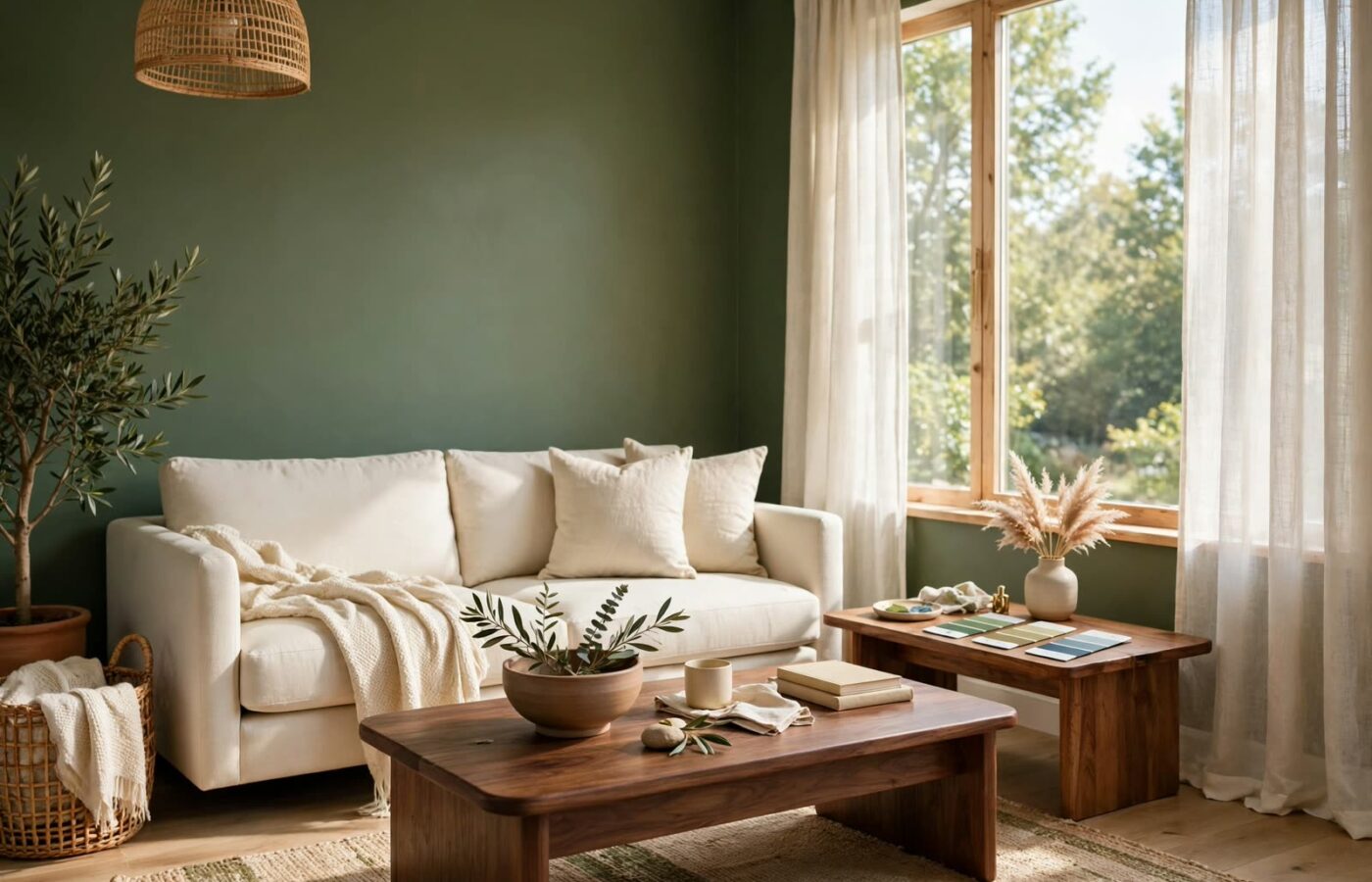
Paint a single feature wall in Webster Green or Grounded, keep the other walls warm white, and let walnut or warm oak furniture do the rest. Dark, grainy wood is the other big 2027 story, and it keeps green walls from feeling sweet or flat.
Kitchen: cabinets first, walls second
Cabinetry is the lowest-risk place to go bold, because it is a contained surface. Grounded on lower cabinets with warm white uppers is the combination designers recommend most for 2027, and Cottage Door on an island gives the same effect in a cooler key. If your cabinets are staying put, Celery on the walls plus new hardware in brushed brass or soft black will still move the whole room into the new palette.
Bedroom: color drenching, done gently
Color drenching — painting walls, trim, doors, and even the ceiling in one shade — is the technique of the year, and bedrooms are the kindest place to try it. A light shade like Celery or Soulful Sage drenched across a bedroom feels enveloping rather than overwhelming, while a deeper shade like Grounded makes the room feel intimate and cocoon-like. If full drenching feels like too much, paint the walls and ceiling in the same color but leave the trim white; you get most of the effect with an easy exit.
Bathroom and entryway: small rooms, big payoff
Small rooms are where the year’s darker shades earn their keep. French Press Coffee on a powder room’s walls, Cottage Door on a mudroom’s built-ins, or Webster Green on an entryway’s wainscoting all deliver a finished, designed look for the price of a single gallon. A repainted front door in French Press Coffee is the classic weekend version of the same idea — one afternoon, one dramatic change.
Before you buy: test the light
Every one of these shades shifts with the light in your room, so never choose from a screen or a printed swatch alone. North-facing rooms get less direct sun and can make cooler colors look colder, which is where the warmer, deeper picks earn their place. South-facing rooms get strong sun that changes a color through the day, so watch a large painted sample in the morning and again in the evening before you commit. Buy a sample pot, paint a large patch, and live with it for two days — it is the cheapest insurance against a repaint.
What the 2027 Picks Mean for Your Home’s Value
Color trends come and go, but the 2027 palette has one advantage over sharper trend cycles: it is built on neutrals with color in them, not on loud statement shades. Greens like Celery and Grounded, and softened blues like Cottage Door, are close enough to the neutral family that they photograph well and appeal to buyers, while still giving a home a current, cared-for feel. The deeper shades — Webster Green and French Press Coffee — are best kept to contained surfaces if resale is on your mind, since a buyer can easily picture their own furniture against them. And if you are not selling, the same logic still applies: a palette rooted in nature ages far more gracefully than one built on a single loud accent.
For a deeper look at one of the year’s headline picks, read our Benjamin Moore color of the year 2027 guide, which covers Webster Green room by room.
Frequently Asked Questions
What are the 2027 colors of the year?
The headline 2027 colors of the year are Benjamin Moore’s Webster Green, Sherwin-Williams’ Celery, Behr’s Grounded, Valspar’s Cottage Door, Dunn-Edwards’ French Press Coffee, Dulux’s Soulful Sage, and Dutch Boy’s Deep Rooted. Green dominates the lineup, with warm browns and a muted blue completing the palette.
Which 2027 color of the year is best for a whole house?
Celery by Sherwin-Williams is the safest whole-house choice because it reads as a tinted neutral — light, warm, and easy to pair with white trim and light wood. Soulful Sage by Dulux is the next-best option if you want a slightly cooler, grayer green across larger spaces.
Are the 2027 colors of the year good for resale?
Yes, with one condition: keep the deepest shades on contained surfaces. Lighter picks like Celery, Cottage Door, and Soulful Sage appeal broadly to buyers, while Webster Green and French Press Coffee work best on cabinets, built-ins, or a single accent wall rather than every wall in the house.
What paint finish should I use for these colors?
Use eggshell or satin on walls for a soft, washable finish that flatters these earthy shades. Reserve semi-gloss for trim, doors, and cabinetry, where durability matters and the slight sheen makes the color look richer. High-gloss lacquer looks stunning on deep greens but shows every surface flaw, so budget for proper prep work first.
Conclusion
The 2027 colors of the year tell a simple story: homes are moving away from cold, showroom perfection and toward warmth, nature, and rooms that feel genuinely lived in. Green leads the change, brown adds depth, and a softened blue keeps the whole palette calm — and because the brands arrived at this palette independently, the shades already harmonize with each other. Start small if you need to: a front door, a kitchen island, or a single bedroom wall is enough to bring the year’s defining colors into your home. Then, if you love the result, let the color spread — one room at a time, at your own pace.